User Interface Overview
Dashboard
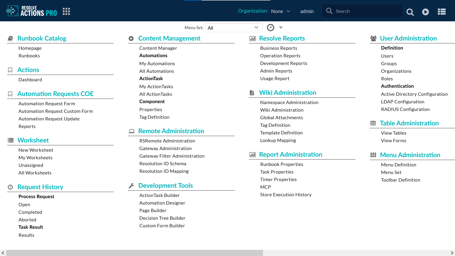
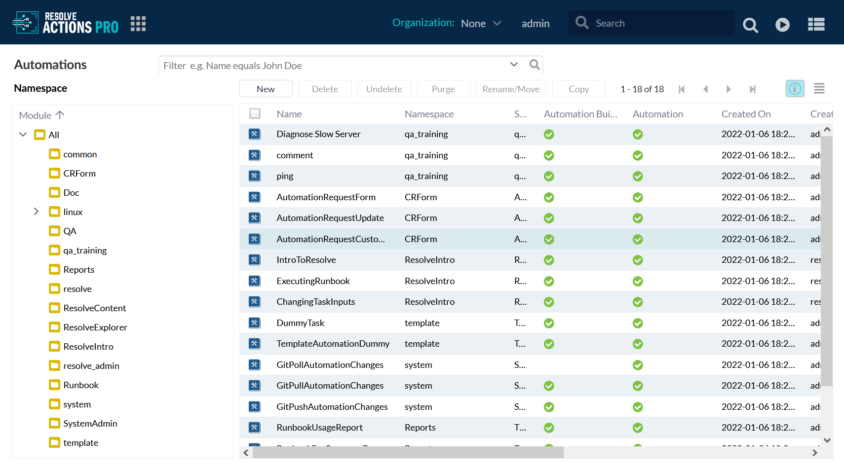
The typical Resolve Actions Pro dashboard looks like the example below. Depending on your role, you will see a different number of menus. Administrators see all available menus.
Main Toolbar
The Actions Pro toolbar is always visible at the top of the screen when working in Actions Pro. It allows quick access to common functionality in the application. The toolbar might differ in individual environments as the administrator can reconfigure what appears on it.

The default toolbar buttons are, from left to right:
- Logo - Product logo, customization is supported.
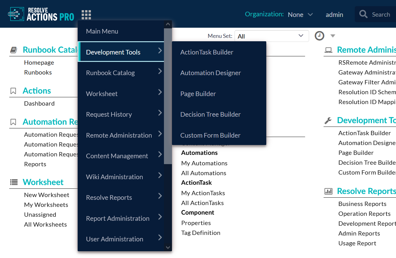
- Main Menu - Navigate to the Main Menu and expand a drop-down cascade list with all menu items which are accessible from any page. Allows quick navigation to any page from any page.
- Organization - drop-down menu with user organizations
- Username/Profile menu - opens a dialog box with account settings option and an Log out option
- Global Search input field - lists recently searched items in a drop-down
- Search button - executes search and redirects to Content Browser page with results
- Go To button - navigates to an existing Runbook and opens it or creates new wiki content directly
- Worksheets button - opens a list of all worksheets and provides the ability to navigate to the list with results
Main Menu
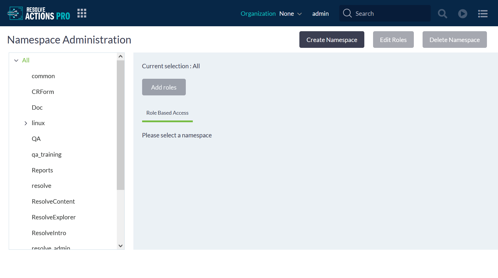
The cascading Main Menu repeats the menu categories and menu items available on the dashboard. As an administrator, you can customize what appears on the Main Menu. See Access to Product Features to learn how to customize it.
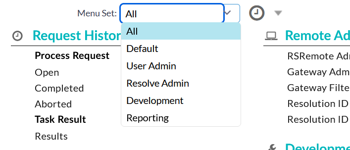
Menu Set
Menu sets are combinations of main menu categories that you can switch between on the Actions Pro dashboard. This way you can quickly filter down to the categories that you need for a specific task. Out of the box, the product comes with a number of predefined menu sets for common user types such as User Admin and Development.
As an administrator, you can create menu sets and make them available to different roles. See Access to Product Features to learn more.
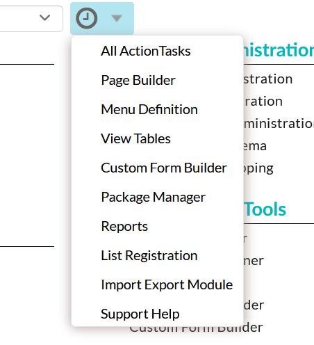
Page History
The page history shows the last few pages that you have visited. You can change how many items appear on the list from you profile menu.
The page history only tracks visits from the dashboard. If you open a page from the Main Menu, it is not recorded in the page history.
Profile Menu
The profile menu on the main toolbar give you access to your user account settings and a log out button.
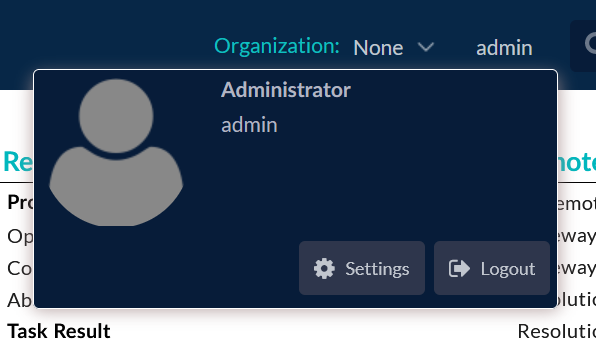
The Settings page allows you to change the following:
Time Settings - change the date and time format
Gird Settings - enable/disable and set custom Auto Refresh interval for updating content in grid pages
Editor Settings (Default, Vim, Emacs)
Menu Settings - customize the number of recently visited ExtJS UI* pages
Display Settings - enable/disable banner display in the Toolbar
Color Theme - default UI theme is Light. It can be changed to Dark or Highcontrast
noteThe "Dark" theme does not apply to ExtJS UI.
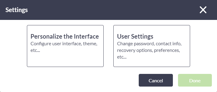
The Actions Pro UI relies on two different frameworks to render web pages. This results in some pages having a different look and feel. Depending on whether you click Settings when on an ExtJS or a ReactJS page, the Settings appear differently. In the latter case, you are presented with an additional dialog box with choices to Personalize the Interface or User Settings.
Global Search
Using the search box in the main toolbar, you can search for keywords in both document titles and body text. Search results are shown in the Content Browser in the following order:
- Name of document
- Document tags (scored last due to type of the field)
- Summary of document
- Description
- Anything else
Wildcard Search
You can use wildcards when searching:
- Use a question mark "?" to replace a single character.
For instance, searching for "c?t" finds "cat", "cot", and "cut". - Use an asterisk "*" to replace one or more characters.
For instance, searching for "r*t" finds "rut", "root", and "rupert".
Wildcard queries can use an enormous amount of memory, particularly a leading wildcard at the beginning of a word (for example, "*ing"), for which all terms must be examined in case they match.
Search with Logical Operators
The standard boolean logical operators are supported:
ANDor&&ORor||NOTor!
If you include several keywords in your search without any logical operators, OR is implied.
Present/Not present Search
Because the standard operators can be complicated, the preference is to use "+" (must be present) and "-" (must not be present). For example, the query "paper + staples -large" states that "staples" must be present, "large" must not be present, and "paper" is optional but increases the relevance.
Proximity Search
A proximity search specifies the maximum edit distance of words in a search phrase. For example, the query '" Democrat-Republican"~5' returns documents with text that includes the two keywords, but only within five words of each other. The closer the text is to the original order in the query string, the more relevant the result, so "Republican-Democrat" is considered more relevant than "Republican Green Democrat". If searching for reserved characters, such as those mentioned previously for Boolean and proximity operators, then escape each one with a leading backslash "\" (including finding a literal backslash character: "\\"). For instance, to search for "Romeo+Juliet!", type in "Romeo+Juliet!" in the Search box. The reserved characters are: + - && || ! ( ) { } [ ] ^ " ~ * ? : \ /. However, Actions Pro searches and returns only document titles, and not body text, for reserved characters.
Search with Regular Expressions
You can use regular expressions to narrow down your search, but queries featuring regular expressions will only search in document titles.
To use a regular expression, wrap the pattern in forward-slashes "/".
For example: /mes?m(er[iz]e)/.
For performance reasons, avoid using leading wildcards in regular expressions.
Refer to Elasticsearch Guide 8.4 for the basic regex operators supported.
GUI Themes
Actions Pro supports three GUI themes: Light (Default), Dark, and High contrast. Users with admin permissions can change the default color theme from the System Administration page by changing the value of default.color.theme system property. The new default theme is applied to all users on that Actions Pro instance.
The login page user interface and color schema cannot be changed and is not affected by the GUI theme selection.
Each user can apply a user interface theme of his own preference. To do that from the ExtJS UI Settings page:
- From the dashboard click the user name in the main Toolbar and select the Settings button.
- From the ExtJS UI page select the third tab - Settings to access the user preferences page.
- The three UI themes are listed In the Color Theme drop-down menu.
- Choose the theme and click on Apply User Preferences button to save the user preferences.
To switch the UI them while being in a ReactJS UI page:
- From the Main Menu dashboard page click on the user name in the main Toolbar and select the Settings button.
- From Settings dialog select second tab - Personalize the interface to access the UI themes preferences.
- The three UI themes are listed In the Color Theme side menu.
- Choose the desired theme and click on the Done button to save the user preferences and switch to the theme.
Light Theme
Applies to all pages in Actions Pro.
Light theme on ExtJS pages:
Light theme on ReactJS pages:
Dark Theme
The Dark theme only applies ReactJS pages.
High Contrast Theme
The high contrast theme is an accessibility feature that assists people with vision impairment. It makes text and graphic elements on the screen easy to read. It applies to both ReactJS and ExtJS pages.
Light theme on ExtJS pages:
Light theme on ReactJS pages:
Toolbars and Tabs
The toolbars for the component editors and viewers in Actions Pro are designed using industry-standard layouts.
Toolbar Actions
The named buttons below the screen name initiate context-sensitive actions. These buttons change depending on the currently selected tab view.
Tab Views
The tabs at the upper-right of the toolbar allow you to change the current view of the element you are working with. Toggle among different tab views with the named tab buttons. For example, in the ActionTask Editor, the tabs are used to switch between different ActionTask Components of the task you are editing. When editing a wiki document page, the tabs are used to switch between View, Edit, and (Edit) Automation. Below the tab views are shortcut icons for common actions among various editors and viewers. If more icons and buttons are available, but cannot be displayed onscreen because of lack of space, then click on the "More..." icon.

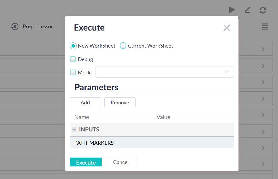
Content Execution
Execute the current ActionTask or Automation Execution options include New/Active Worksheet, Debug, Mock, and Parameters. For more details about execution refer to Automation Execution and ActionTask Development.
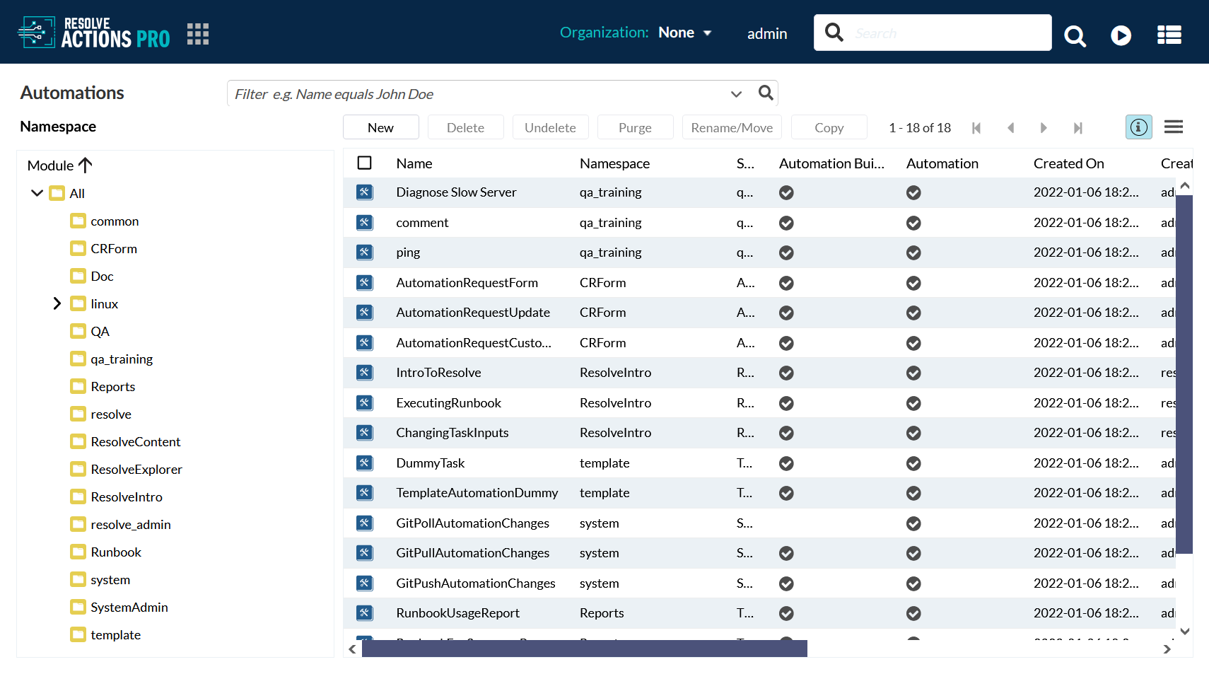
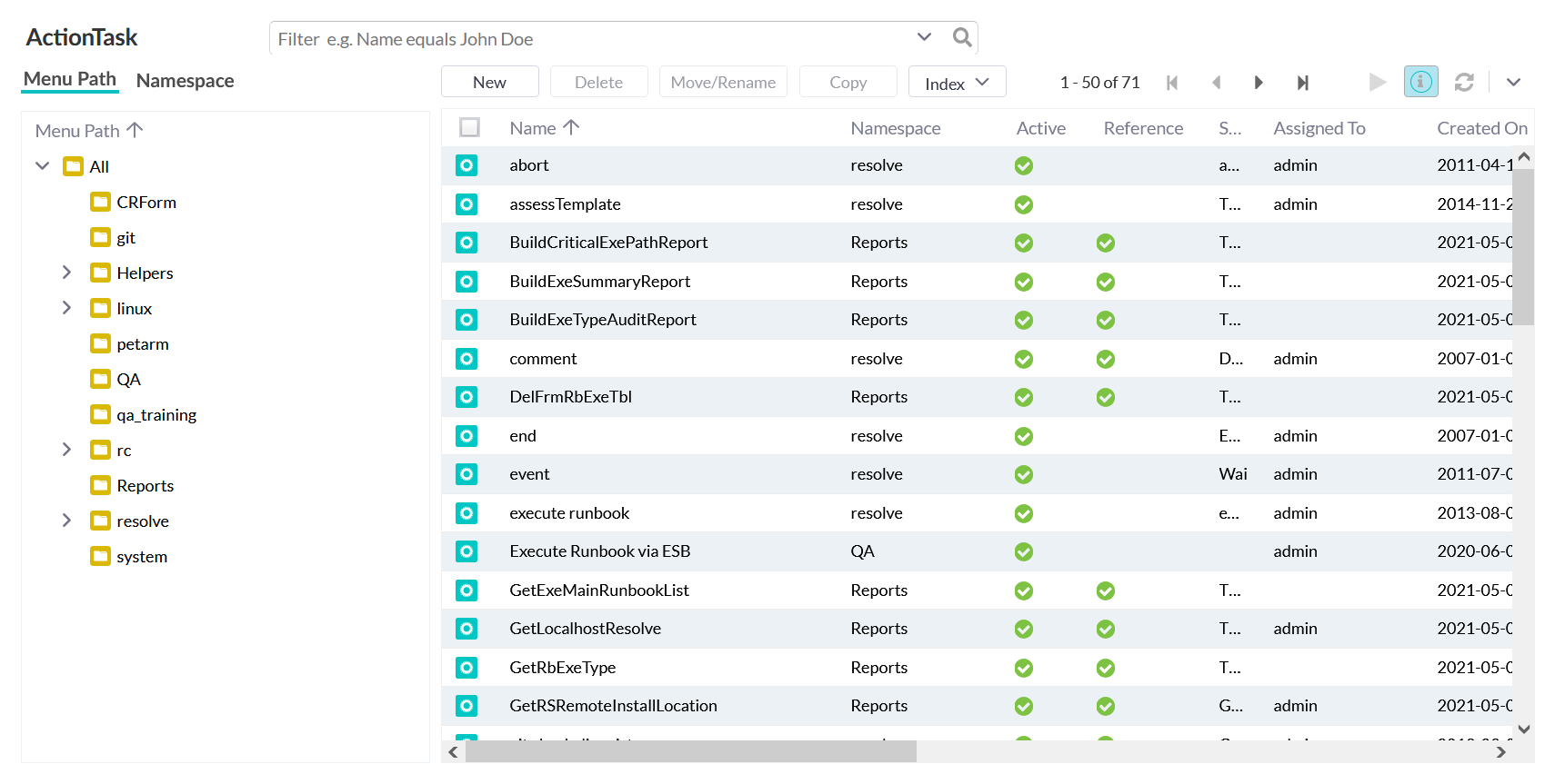
Lists (Grids)
List or grid screens are used throughout Actions Pro to display tabled lists of items. Lists allow the information to be sorted (via column heading), searched, and other context-dependent actions.
To manipulate elements, use the taskbar buttons at the top.
To view details about an element, either click the element name or the icon in front of it.
Use the column headers to sort the list in ascending on descending order. Click the arrow on any column header to reveal a context menu that you can use to add or remove columns. Clicking the System Information toolbar button toggles the visibility of the system columns: Created On, Created By, Updated On, and System ID. To reorder columns, use drag-and-drop.
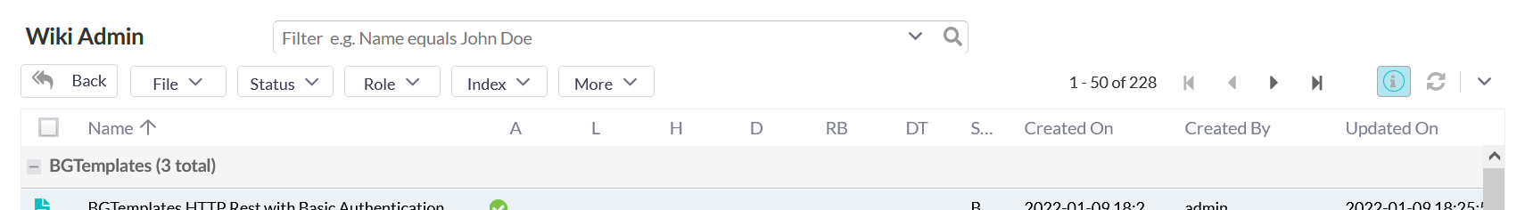
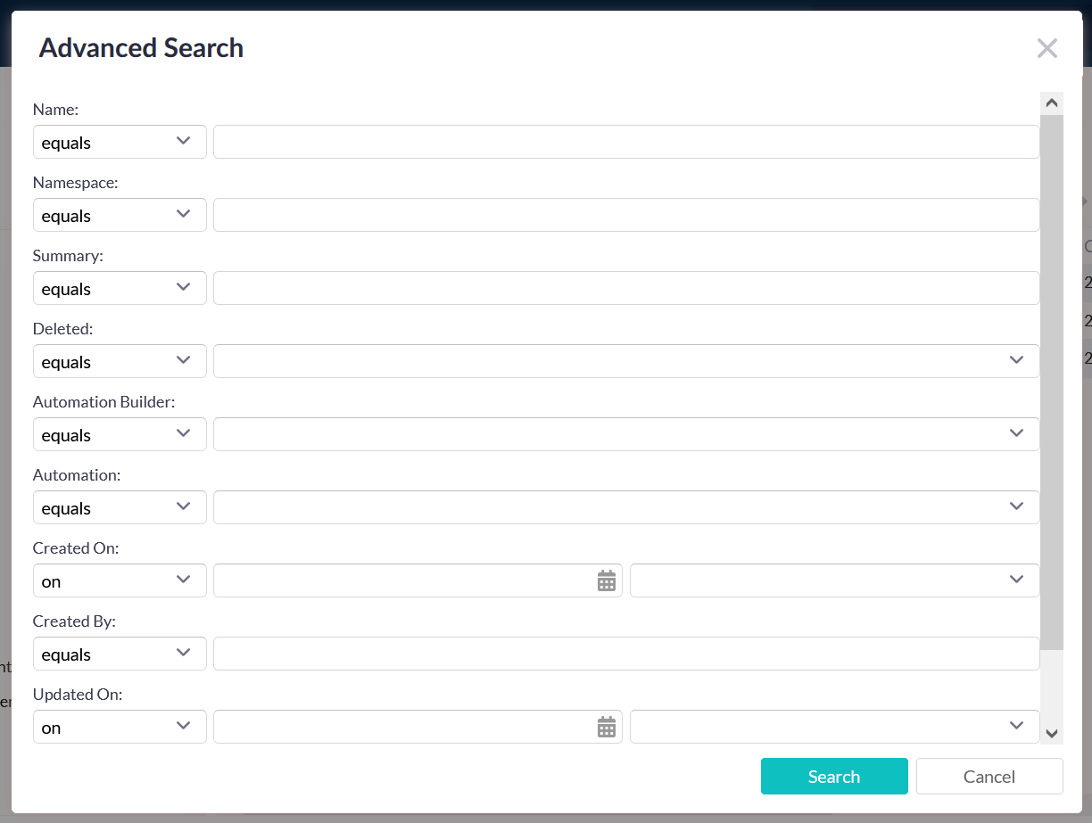
List Filtering
List or grid screens offer the Advanced Search query field at the top of the list/grid. Advanced Search will automatically suggest search terms and expressions as you type.
Advanced Search allows you to create fine-tuned queries for listed items. To initiate Advanced Search, click on the drop-down arrow in search input field of each page. Search fields and criteria are available based on the columns in the list.
The selection field choices vary depending on the starting point (i.e. Worksheet, Runbook, Wiki Administration, ActionTask etc.). The limiters are shown below. You may choose none or all.
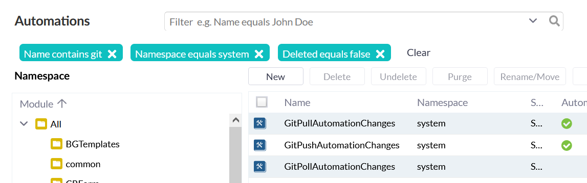
Each additional search query "stacks" at the top of the list, further narrowing the results. You can easily dismiss individual queries by clicking its X sign or you can dismiss all by clicking Clear.
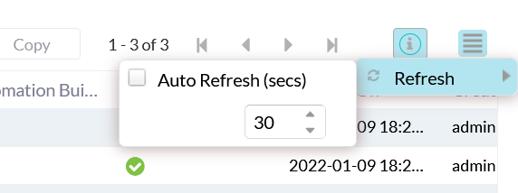
List Auto Refresh Interval
Some lists (such as the Worksheets list) have the option to refresh automatically at a given interval. To set the auto-refresh for a list, click the drop-down arrow on the "Refresh" icon. Check the "Auto Refresh (secs)" box and specify an interval.
To set up auto-refresh for all ExtJS UI pages:
- Open your profile menu and select Settings.
- Find Grid Settings and click the Auto-refresh check box to enable it and define the refresh period (in seconds).
- Click on Apply User Preferences button to save the changes
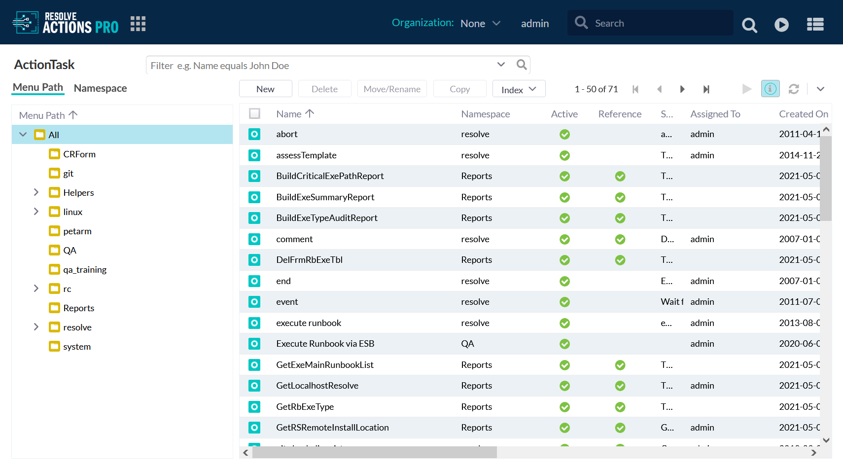
ActionTask Tree
The ActionTask Selector Tree provides a hierarchical view of available ActionTasks. The ActionTask tree is displayed in:
- Content Management > All/My ActionTasks lists from the Dashboard or Main Menu.
- Select ActionTask dialog box when inserting ActionTasks in automation, with the Automation Builder. (See Automation Development).
Worksheet Selector
The Worksheet Selector:
- Accessed using the Worksheet button in the Actions Pro main toolbar.
- It is used to view the results of any Runbook automation, including processes run by a decision tree within the Decision Tree Viewer.
- A Runbook will log the results and conditions of every component ActionTask to the current Active Worksheet.
- When a Worksheet is active, all new results from all Runbooks and ActionTasks display in that Worksheet.
When viewing Runbook and ActionTask results within a Runbook wiki page, the results that get displayed are the most recent results retrieved from the Active Worksheet. (See Development Guide; Document Development/Displaying Runbook Results and Details).
- If there is no Active Worksheet, then results are not available.
- You can use multiple Worksheets at any time, and switch among different Worksheets to set as the Active Worksheet to record results onto various Worksheets.
Each Worksheet is uniquely identified by a "WS" number. The Worksheet may also contain additional reference identifiers (e.g. "Reference", "Alert ID", "Correlation ID") which refer to external system IDs from other applications such as;
- ticketing
- fault management
- provisioning system.
To access it:
- Hover the cursor over the Worksheet icon to view the current Active Worksheet. The "WS" number for the Worksheet associated with an ActionTask or Runbook open in a web browser is listed in the browser tab.
- Click the icon to access the "Worksheet Selector" dialog box.
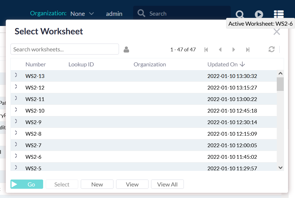
Use the Worksheet Selector to:
- change the Active Worksheet (on which automation results are written)
- resume a paused or dropped automation Worksheet
- view any or all saved Worksheets.
The command buttons are as follows:
- Select - (or double-click on a Worksheet) makes the highlighted Worksheet the new Active Worksheet. The wiki page will refresh to reflect the current Worksheet state (if a decision tree or document wiki was previously used).
- New - creates a new Worksheet that automatically becomes the Active Worksheet. It is good practice in general to execute each Runbook on a new Worksheet, unless a user wants all automation results of a decision tree to be listed together. In any case, each run-through of a decision tree should use a new Worksheet to "refresh" the wiki display and prevent artifacts from previous runs to interfere with a new decision tree.
- View – accesses the results screen of the current Active Worksheet (if no Worksheet is highlighted), or the results of the highlighted Worksheet (but does not set it to Active).
- View All accesses All Worksheets List from the Worksheet menu.
- Go - is used to resume the last step performed in a decision tree or automation that had been paused (for example, a connection might have been lost, or the decision tree stopped). Pressing "Go" will continue the last Active Worksheet.
- Continue - If multiple decision trees or wikis used the same Worksheet, then the "Continue" button appears within the Worksheet.
- Pressing "Continue" is similar to "Go", except "Continue" will resume the last step for that specific decision tree or automation.
- "Go" pertains to the overall last decision tree.
- Both "Continue" and "Go" accomplish the same result for the very last process used.